Introduction and foreword
By Joel Tjintjelaar
The following article on better digital black and white photo printing is again written by guest writer Red Ognita, who’s not only a multi-awarded black and white fine art photographer based in the Philippines, but he’s also a specialist in creating fine art black and white photographs. Many times in the past I’ve stated the importance of printing your work, especially if you consider yourself a fine art photographer: a photograph can only be considered a fine art photograph if it’s at least printed, anything else is digital art at best. The time and effort spent on the creation of a photograph can only be appreciated if it’s printed and if it’s printed by a good fine art printer. Please read more on the importance of printing digital photographs in Red’s previous guest article.
If you want your work to be printed in the best way possible then I can highly recommend visiting Red Ognita’s website or visiting his RedLab Facebook page where he talks passionately and with a lot of knowledge of creating fine art prints and the importance of printing in this digital day and age. Please enjoy Red’s article where he talks about “Better black and white printing”, which will be the first article in a series on better black and white photography printing in the digital age.
Making a black-and-white print is easy
Manufacturers have reformulated their ink sets to include multiple blacks and highly saturated colors to produce a better digital black-and-white print. Printer brands also produced their own software solution, rendering digital black and white photography files differently. All you need to do is read a bit, select options then press print.
But how would you know how that you’re producing your best? Do you even like to know?
If you do, test and compare. Compare the data and methods. It is not enough only to compare the tools, you must also compare the processes.
Comparing print paths
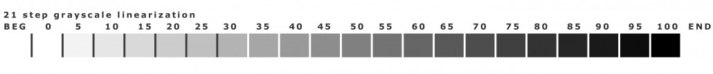
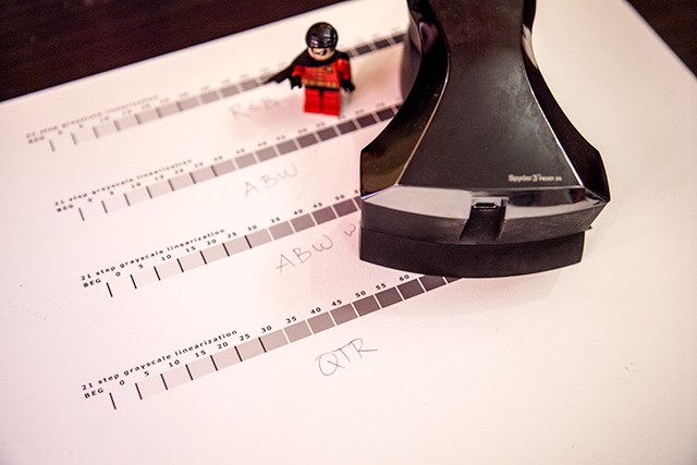
I have printed a 21-step wedge for measurement on Hahnemuhle Photorag fine art paper. I chose this paper for its long history (1584) in paper making and its popularity amongst digital printmakers. Arguably, Hahnemuhle has one of the best canned profiles (ICC profile readily available) in the market today. Having a good baseline in testing is necessary to ascertain if there are any differences with the printing routes. Additionally, if there’s any improvement with HPR, it is almost certain that there would be significant differences with others. I will be using a Datacolor spectrophotometer (Spyder3 print SR) to measure. Note that the test strip was not printed to serve as a target, instead, it was printed as a step-wedge to test the black-and-white linearity of different printing paths (printing a target dictates a different process)
Why does it have to be linear? A linear response solves a lot of challenges when printing Black and White; abrupt tonal jumps (banding); reduced metamerism; consistent gray balance; high dMax without sacrificing shadow detail; print permanence (less yellow ink; the most notorious color) and the ability to produce a neutral color (no colorcast)
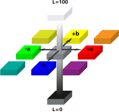
That straight line from top to bottom is where you’d want to be. That’s Luminance. Move a wee bit and you’ll touch color (colorcast)
Individual measurement results: From Left to Right
* RGB printing with canned profile
* ABW (Advanced Black and White)
* ABW with custom luminance ICC
* Quadtone RIP
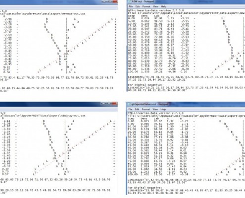
With the data above, it seems that it’s a toss-up between the RGB with canned profile, ABW, and QTR. Here’s a side-by-side comparison.

Conclusion
As expected, the Hahnemuhle canned profile performed very well, but there is a significant improvement using the QTR. Aside from the evident (visual) smooth transition from Black to White of the test strip printed with QTR, the data also shows a higher dMax and a more linear response. With a bit of tweak, you can even see tonal differences in 2% steps (the 21 step-wedge is 5% increments)
If you’re serious about digital Black and White photography printing, you owe it to yourself to try using QTR.
http://www.quadtonerip.com/html/QTRoverview.html
Making a digital black-and-white print is easy, but how good your black-and-white print is, is another question. How determined you are in achieving the best black-and-white print is something that you alone can answer. Remember that printing is only as complicated as you’d want it to be.