

Listen to the AI-generated podcast of this article as a summary
Guide To Black And White Photography – Part 1
Part 1 of a guide to give some insight in black and white photography and how to create better black and white photographs.
There are so many tutorials on the Internet on black and white photography, also my website has quite a few technical black and white photography tutorials. But what is really important to know about black and white photography and where do I start? What is black and white photography and why should I use it instead of color? In the first part I will try to answer a few elementary questions regarding black and white photography, demystify some myths surrounding black and white versus color and I will also go into how art relates to black and white photography. In part 2, due to be published in two weeks, I will give an overview of black and white processing techniques, I will compare them and give you some pointers on how to start and if you’re an advanced photographer, also on how to improve.
Why Black and White Photography
This is a question that has been asked to many black and white photographers, usually by photographers who are just starting and have the natural tendency to shoot color first or by seasoned photographers who still doubt the technical, aesthetic or artistic justification of black and white over color. Especially in this digital age where even small phones are capable of taking high quality color images.
You could argue that the preference of black and white over color or vice versa is a highly subjective and personal preference. I will try to argue that it’s not just a subjective preference but that there are also more objective arguments, sometimes based on scientific evidence, that black and white can work better than color.
First start with the arguments that the color advocates have for not using black and white, then the arguments of the black and white advocates. They don’t reflect my opinion, I’m just stating them as I have encountered on many occasions. Then I will present a view that’s entirely mine and will address some of those arguments, but not all. On average I find all of the arguments, both from the color and black and white advocates, highly arbitrary and based on unsubstantiated feelings rather than on convincing more objective ideas. But perhaps you may deem my view the same. That I leave up to the reader, I merely try to present an alternative and more substantiated view.
Color vs Black and White – The Common View
Pro Color
- Black and white is outdated, it was used only because the technology was such that we couldn’t shoot color
- Color is more realistic than black and white
- Color is more expressive than black and white
- Colors have more depth than black and white (we will see that this can never be true)
- Why use black and white at all if you have color?
- Etc.
Pro Black And White
- Black and white is more artistic, it is art
- Black and white has more soul/emotion/atmosphere
- With the removal of color you reveal the essence of things
- One looks at a color photograph but one looks into a black and white photo
- Etc.
Color vs Black and White – My Personal View
Instead of addressing each one of them, I present you my thoughts that have been presented earlier, in a slightly different context and form, in a recent article of mine on Advanced Split Toning Techniques for Black and White Photography and other writings.
1. Black and White photography is a step away from reality adding authenticity and beauty. I’ve always advocated that I like to move away from reality as many steps as possible. My argumentation was that the more steps you move away from reality, the closer you will get to the essence of the artist and the more the expression will be an authentic representation of the subjective experience of the artist only. This should be done either in-camera or in the post-processing phase, but preferably both. But there was another, deeper and Intuitively felt reason for moving away from reality: every step away from reality adds something substantial to the aesthetics in a work of art. Simply put: it becomes more beautiful.
I was always under the impression that this was something personal and intuitive, and it sufficed for me to pursue my black and white photography along those feelings, but research in neuro-aesthetics by neuroscientists V.S. Ramachandran and William Hirstein in ‘The science of art’ on how the brain responds to art and aesthetics, have shown that objects or scenes that are distorted, exaggerated or more abstracted or which have the emphasis on very specific qualities of objects or scenes, are considered to be more aesthetic. In other words, a hyperrealistic and more abstracted depiction of objective reality is universally appreciated as more aesthetic. Even though Ramachandran’s and Hirstein’s work has received some criticism from other neuroscientists, to me, the conclusion and the way they came to that, was a confirmation of something I always felt intuitively and subconsciously.

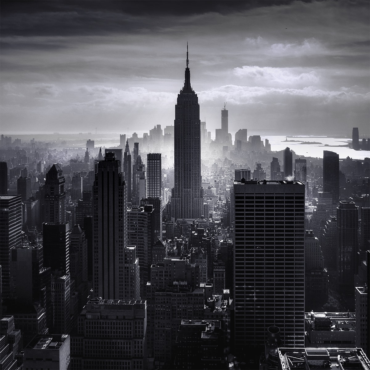
2. Black and white photography has more visual depth. Black and white photography is an interpretation of the world around us in differences of luminance values. In other words in differences of lights, also known as light contrast. This means that through the use of one color, the color gray, the differences between luminance values become clearly visible in a way that is almost impossible in color. The visual distractions of different hues and saturation in color make it very difficult to see differences in luminance. This is important because it’s through differences of luminance that we can perceive depth and create depth in an image by adjusting the luminance values or light contrasts. Colors only (hue and saturation) can’t create depth, it’s the luminance element of color that creates depth, along with the depth created by using perspective lines. The reason of this, if I can call it a reason, maybe it is the cause, is that perception of depth, together with spatial organisation, motion perception, are generated in the color blind part of the brain. The part of the brain that only detects differences in luminance also called the Where system. The part of the brain that detects objects, faces and color are in a different part of the brain, called the What system. Neurobiologist Margaret J. Livingstone describes these systems in detail in Vision and Art – the biology of seeing. It’s for this reason that black and white photography offers more depth, if the photographer/artist is aware of the effect of differences in luminance. Black and white photography is the art of creating images through differences in luminance. Color mostly has a symbolic and aesthetic function in art, to add mood for example. I could add to that: by moving away from objective reality, by removing colors, you will at some point end up in a reality that is more real and closer to what we essentially experience.
Colors are only symbols, reality is to be found in luminance alone – Pablo Picasso
One important conclusion that can be drawn from the above is that colors don’t create depth, only differences in luminance value do that. Consequently, if you’re a color photographer and don’t pay attention to the actual luminance values (you can do that by desaturating the image from time to time in a separate layer) your color photo could miss the depth you thought you were creating by only creating color contrasts and not light contrasts.
Returning to the arguments of color advocates and black and white advocates, you can conclude indirectly from my thoughts as I presented them, what I believe is true, what is simply not correct or what is still subject of debate. I want to address one subject of debate specifically, and that is the often expressed idea, that black and white is considered to be more artistic, that it is fine art, while color can also be art, but not per se.
Note on desaturation
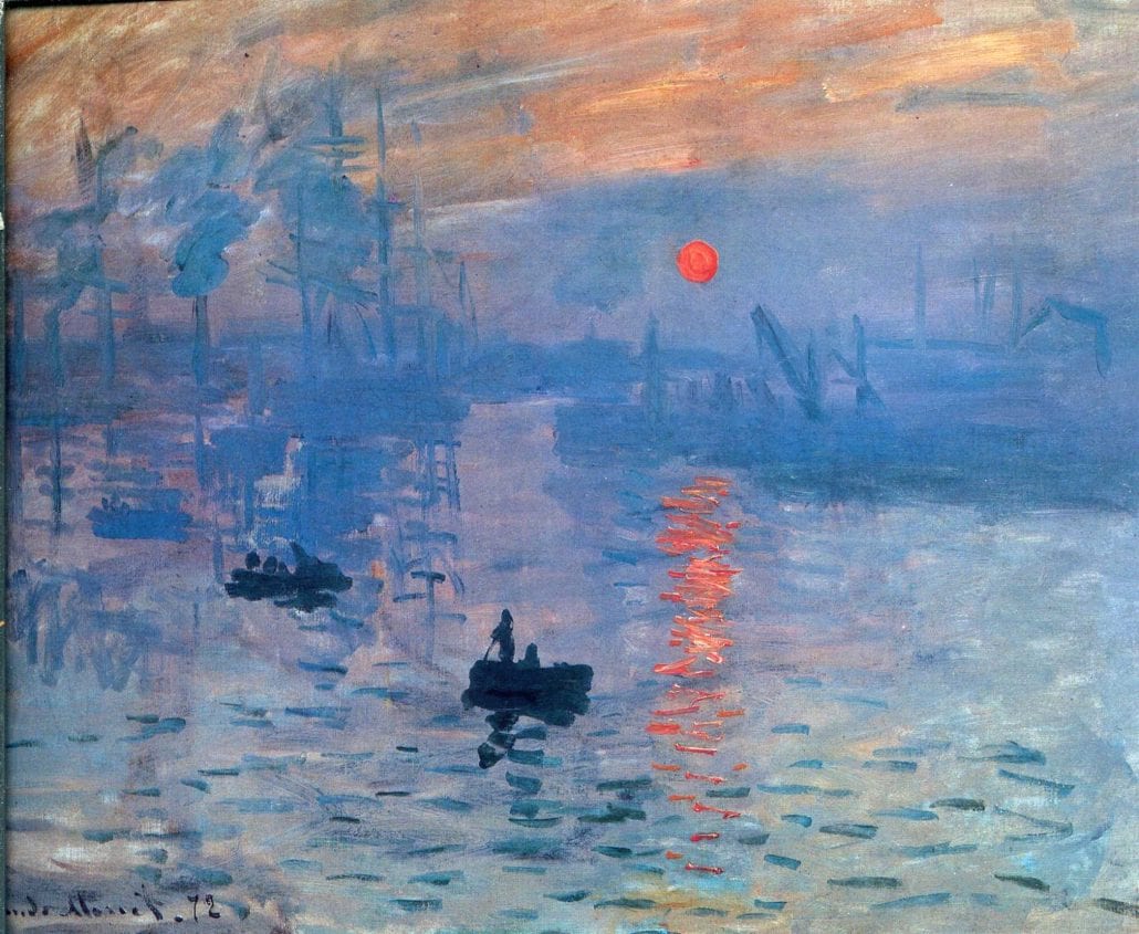
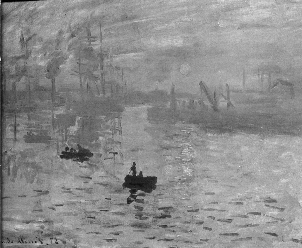
Note that in the above examples I desaturated the images to black and white as it theoretically should be a neutral black and white conversion without affecting the luminance values. After all the saturation is set to zero while the brightness remains the same. In practice in Photoshop, this is not true since Photoshop averages out the RGB values per pixel to calculate the gray value. For example the orange color with the RGB values (237,140,63) will get the gray value (237+140+63)/3 = 147) (147,147,147). But it comes close to being neutral for the sake of explanation. The most neutral conversion to black and white is by using the luminosity blending mode in photoshop with a gray (or black or white) layer below the second (duplicated) color layer. The luminosity blending mode uses the luminance values of the color layer and the hue and saturation of the layer below. Since that is a gray layer, the result is a B&W layer with exactly the same luminosity values as the color image. This is also the way Silver Efex Pro2 and Topaz for example generate the B&W neutral conversion presets. More on this in part 2 of this series of articles on B&W.
What Is Fine Art?
As I’ve stated in my fine art photography manifesto on my website: not all photography is art, but a great photograph has everything that all art has. Art isn’t just a beautiful photograph, but it should move us, inform us and make us experience something we didn’t experience and know before. Art makes us forget about the beauty of it that initially drew us in and experience a beauty that encompasses the visual and the imaginary.
Therefore, photography can be fine art if it:
- has an aesthetic appeal
- informs us and communicates a message that triggers an experience that hasn’t been experienced before
“Art is a form of expression we reside to if we wish to express an experience that hasn’t been experienced before to evoke an emotion through beauty”
Joel Tjintjelaar
To start with the second bullet, the communication of a message, its role is often debated in art but Abstract Expressionist painter Mark Rothko for example, once said; :”There’s no such thing as art about nothing”. I tend to concur with that. I’m not referring to a literal message only; a message that can only be explained in comprehensible words. I’m also referring to a less literal and more abstract message. This message can be communicated through any means of human expression: sometimes through words, other times through sound and music, sculptures and other objects, or through body language and last but not least through images. Each one of them are part of a universal language.
An emotion is also an experience. A very strong experience that can’t be limited to any arbitrary set of emotions. In principle, any experience is also an emotion and the artist aims to evoke such an emotion, through beauty.
“Art is a human activity consisting in this, that one man consciously, by means of certain external signs, hands on to others feelings he has lived through, and that other people are infected by these feelings and also experience them”
Leo Tolstoy
How can you communicate such an experience in photography?
There’s no simple rule to that but one needs to be aware that in art, what is depicted, colors and objects, are usually symbols. In fine art photography, the object that is being photographed, usually has a symbolic purpose. Alfred Stieglitz, the spiritual father of fine art photography, called the use of objects in photographs as symbols for an idea or an emotion to communicate ideas and emotions, Equivalences. The object that we choose to photograph as a fine art photographer, is an object we choose, consciously or subconsciously, to communicate a message through its symbolic meaning.
In any case, art is more than just a beautiful object, but also communicates and triggers an (emotional) experience. Whether the act of communicating this experience is a conscious or subconscious, is irrelevant.
But art always has an aesthetic aspect. And as I’ve described earlier, one of the ways to achieve aesthetics is through moving away from reality. And now we have come to the first bullet point that I have described earlier in this article. I want to conclude with giving a few suggestions on how to to create aesthetics with the steps I always include in my work to move further away from reality.
The goal of moving away from reality as many steps as possible addresses largely the aesthetic aspects of my work. In photography I use the following techniques to move away from reality.
- Represent the world in black and white, as a world in black and white is not a real world but a world where the luminance values dominate and are exaggerated.
- Represent the world through use of long exposure techniques. Long exposure reveal an invisible world that cannot be seen by the human eye. A world in which time has been prolonged to distort objects.
- Represent the world in exaggerated luminance values: adjusting luminance values and contrasts in such a way that depth is exaggerated or even distorted. This is the principle of creating presence.
- Represent the world in exaggerated proportions or distorted views through the use of mechanical tools like lenses or in composition by emphasising or distorting perspectives.
To Conclude
Black and white is one way of moving away from reality to infuse you work with aesthetics, and obtain a work that can be considered art. But it is not the only way, nor is every black and white photograph a fine art photograph by definition. Color photography can be art too, of course. And color has the power to add mood or symbolism to your work.
Use of black and white is just one of the tools you can use to create art in photography but be aware that it’s only useful and effective in combination with other tools from your artistic toolkit. The statement that black and white is equal to fine art has to be dismissed. But dismissing black and white as a meaningful way of expression, and qualifying it as a less beautiful and outdated way of expression, that has nothing to do with reality, are statements that ignores the essence of art.
Why not use black and white if it is already one step into the direction of art?
Other Resources
- More on black and white photography and fine art photography can be found in the eBook From Basics to Fine-art, that I co-wrote with Julia Anna Gospodarou
- More on my thoughts on fine art photography called Subjectivism.
21 Responses
So Joel, by your definition of art, no poet or a writer is an artist.
Shreedhar, no that’s absolutely not what I said. I should’ve made clear that writing and poetry is absolutely art too but discussing that was beyond the scope of this article related to photography and visual arts. To me great writers and especially poets communicate an experience, in words that we as visual artists cannot communicate. They’re artists, no shred of doubt about it and I can only admire the way they can transcend me to another vividly felt world with words only. – Joel
PS I’ll change the wording a bit without elaborating too much on other forms of art. – Joel
Joel, I am a great fan of yours. I have also bought one of your videos. I regularly read your posts and thoroughly enjoy it. Of course, knew you did not meant it the way it came out. I was just kidding. Reading them again, I think that my words came out too terse and it looks like a serious objection. Sorry about it. Cheers.
Shreedhar, no I wasn’t offended at all. And besides, you were right, it looked like writing was not an art form. Since I love literature and writing myself that was something I needed to change to better reflect my views. The original text was too rushed and now I took the time to think it through and it should be better. Thanks again Shreedhar, Joel
PS Shreedhar, the writings on your website are very interesting and beautifully written. I’m definitely going to read more of your articles. Joel
Thanks Joel. I am very happy that you liked the articles.
I’ve always battled with the notion of making an image outside of reality yet plainly in it. For me there’s a need to find a balance between keeping it real and making it unreal, as in the early days of HDR when overproduced photos bordered on garish or just went full out emphasizing that garishness. It struck me as new and exciting and extremely dull. I think luminance-be-damned may have been one of early HDR’s provisos.
One reason I personally prefer B and W is that it’s infinitely more interesting to work on in post production. I’m sure it’s the opposite for many others.
I enjoyed Margaret Livingstone’s book years ago and may have to pay another visit. (Wish she’d do another book!)
Thank you for this thoughtful essay which I will share with a pack of fellow photographers and bounce around our own ideas. I’ve always felt that the most important gift a work of art can offer the viewer is allowing her to see the world differently, to make her think anew, and knowing the work of luminance in an image is invaluable in creating space for that deeper look.
Thanks for your response Dominic. I too am still considering where I should draw the line for myself when it comes to ‘move away from reality’. There’s a point that it loses the aesthetics. But not only that. It can also lose the essence of the medium we’re using. In that case you should call it something different, digital fine art for example, but not photography. I still want to capture that one moment out of reality with my camera that I find so intriguing. That’s just my personal take on it. Please share with other photographers/artists! – Joel
I am an experienced photographer, though an amateur, and I am strongly drawn to the four techniques with which you conclude this article. With humility, I would like you to see one of my early attempts (unfortunately you may have to copy and paste the URL):
http://joewatterson.zenfolio.com/p500322939
Thanks Joe, you have a beautiful gallery btw. – Joel
“There’s a point that it loses the aesthetics. But not only that. It can also lose the essence of the medium we’re using.”
What came first, the existence or the essence? 😉
I think the essence:)
http://www.primaryfocusphoto.com/why-color/
Nether color nor black & white Photography need to be defended. Their are those who feel differently. Color is not an addition but black & white is a removal. Removing color information changes but does not destroy the intent of a Photograph. In the past black & white was a necessity. Today, it is an alternative.
Thanks Doyle, I agree with you that neither color or B&W need to be defended. But in this day and age of full color digital photography people need to be informed why there is an alternative in black and white, and that it isn’t an anachronism, but as you put it: an alternative. PS: from a technical point of view, color is an addition (through use of the Color Filter Array) and black and white is what the photo sensor can record without the addition of a CFA.
Joel
Hi Joel,
I’m starting my journey into long exposure Black and White Photography and have been reading your page for awhile now. It’s inspiring as is your work. Thank you for everything.
Bob
The magic of colorless photos! Thanks.
Great contrast!!!! thanks for sharing
Black and white fine art photography is always creates calm environment. We are the great supporter of wildlife fine art photography. https://ejazkhanearth.com/
I like the Arctic Fox black and white picture the most Thanks Niaz!
https://ejazkhanearth.com/fox-pictures/
Thank you for sharing your thoughts on this topic. You managed to say what I’ve been trying to say and hoping someone would say for a while.
For me it boils down to this.
What I want to do is best done in black and white.
The choice reflects my vision. My goals. My motives. My understanding.
In a word… stark. Less is more. Both blunt and pointed at the same time. Oozing depth, drama, mystery. Film noir frame by frame.
Thanks again for explaining the why behind the what.