Days
Hours
Minutes
Featured Image 1920x800

Top 5 most common mistakes in B&W photography

Top 5 Most Common Mistakes in B&W, long exposure and architecture photography

I’ve made several top 5 or top 10 lists on my blog in the past. Usually, it would follow a positive pattern: the 5 best, 10 great tips, etc. Now, I’m presenting a top 5 of things many B&W photographers do but aren’t aware that they’re doing it and shouldn’t do. Nothing new in terms of the format of course, but I’m going to list 5 things you should avoid and only a few, or maybe even no one at all, will tell you about.

And as usual, I’m always trying to share information that isn’t information you’ve heard hundreds of times before. Because rehashing information is something you won’t find on my website. And if I accidentally do, then my apologies, but I can’t always be aware of what’s going on.

Listing takes place in random order because they all need to be avoided.

5. B&W Photography: Not all contrast is created equal

B&W photography is all about contrast. Make it contrasty. True and at the same time not true. Let me explain. First: yes it is about contrast, but let’s be more specific. When we talk about contrast in general then almost always we’re referring to tonal contrast. Or the difference in luminance values. But that’s just one type of contrast. Color photographers know that there’s also color contrast and how making good use of the color wheel, e.g. using complementary colors to make an area or object stand out, can benefit your photo. Not many people know that there’s also dimensional contrast. What I mean by that is the effect of using contrasting depth dimensionalities like a flat 2-dimensional sky versus a 3-dimensional object. Or in the specific terminology, I use in my classes: contrasting depth dimensionalities between Figure and Ground. I believe not many are aware of this contrast type to increase the contrast in more than just one way.

So, to go back to the topic at hand, for the sake of simplicity and to highlight the perhaps most important principle in B&W photography: we’re now only referring to tonal contrast. Yes, a good B&W photo needs to have great contrast, but the mistake many photographers make is to think that the contrast needs to be all over the photo or global. Well, and that’s where they are wrong. Good contrast is not global contrast or an overall ‘contrasty’ photo spread out over your Ground and Figure (the ground and figure principle is a principle introduced by Mark Getlein in his book Living with Art) throughout the photo. No, good contrast is Selective Contrast that enhances your most important object in the photo: the Figure. Good use of contrast means the highest contrast (and the brightest light) should be in or around the Figure: in or around the most important object in the photo. Because the human eye is always drawn to the parts in the photo with the highest contrast and the brightest light. So draw them in to the most important object in your photo, not distract the viewer from it by placing contrast everywhere. Create selective contrast, don’t just make it ‘contrasty’.

4. B&W Photography: Linear patterns caused by gradients

I would say that one of the most powerful tools in photo editing software is the gradient tool. Powerful because you can create depth perception with dark-light-dark transitions. The perception of depth is based on the difference in luminance values. It takes place in the color blind part of the brain. See Margaret Livingstone’s Vision and Art and the Biology of Seeing.

It is a very powerful tool and essentially everything I do in Photoshop, almost every step I make in PS is done with the gradient tool. People who know about my Advanced Masking technique know that I even create hard masks with the gradient tool. Not just a quirk, but a necessity as I prove in my classes. So, the gradient tool is one of the most powerful and yet also underrated tools. Most photographers use it to create a gradient in the sky. Or in the water. And most of them do it wrong. A good gradient is not just a transition from dark to light or vice versa. It is a subtle and well-thought-out transition from dark to light or light to dark. What I almost always see in many photos is not a subtle transition. So when is a transition not subtle enough?

There’s a very easy trick to detect those: just zoom out the photo to thumbnail size or squint your eyes. I would recommend zooming out. If you see a dark almost linear black band then it is not subtle enough. And always, and I mean always, it is either in the top edge of the photo, in the sky, or in the bottom edge of the photo, in the water or foreground.

If I can see, if anyone can see how it’s done, it simply is not subtle enough. A black band is a clear sign of a gradient effect not executed well enough. 

Don’t make the mistake of not zooming out: if you apply a gradient and you see it full screen, you won’t be able to notice it. But zoom out to thumbnail size and you can easily spot those sloppy gradients. 

If you spot them: make it more subtle. If you don’t know how then practice, practice! Even better, know how to disrupt the linear pattern. As it is almost always a linear band you see, sometimes a circular band, if you use the radial gradient tool. Disrupt the pattern and make it less linear. You can do that by using luminosity masks or applying other tricks. And no, I’m not going to explain that here as it is impossible to explain that in writing. For that, you have to see me doing it. And you can see me doing it and explaining it in my online classes or in my new video B&W Fine art processing. For now just remember that if you see that dark black linear band, you need to fix it.

3. B&W Photography: Dark tones unnecessarily out of range (or: contrast is alway relative)

I’ve done a lot of darker work in the past, and still do occasionally: dark skies, dark foregrounds, lots of deep dark shadows – even when I produce lighter work, there’s always something really dark in there. And I do it for specific reasons. One of those reasons is the artistic thematic and stylistic preference: things emerging out of the dark, coming into the light, and then disappearing in the dark again, was just an important theme to me. You don’t need to have a degree in art to see the symbolism expressed through the stylistic preference. Because yes, it is also a stylistic preference. I just like things dark in my work.

Then there’s also the compositional and technical aspect of the darkness in my work. I darken with the goal to obscure parts in my photo so those parts will be avoided and the focus will be on the important Figure in my photo (see #1). But I do not just darken parts. What’s more important is to lower the contrast first to remove the distraction and then add darker tones to make the distraction almost non-existent. Because the objective here is to, again, lead the eye to the Figure that should have the higher contrast. And this may sound very logical but actually, it isn’t because very few people are aware of it: you can make the contrast higher in or around the figure, not just by making the contrast there higher, no, you can also make it higher by LOWERING the contrast in your adjacent ground. And that, unfortunately, you don’t see enough.

Everything is relative. High contrast in a photo is only there due to the presence of lower contrast somewhere else in the photo.  It can never be there autonomously. You can make an important object in your photo very high in contrast, not by abusing the s-curve with your PS curves tool, but by leaving it alone and lowering the contrast everywhere else, usually in the ground, first. The opposite applies also: you can make something look really dark by increasing the contrast in the adjacent area, not by darkening the dark part even more so it becomes pitch black. Relative contrast.

What I often see when people try to create darker work, is that they just overdo the darkening. There’s no need for shadow areas to have luminance value zero (L0 in B&W notation or (0,0,0) in RGB notation) where L23 (in zone 0 btw) will suffice. You make it look too hard, too much, too dark, not subtle enough. I often use zone 0 in my photos with plenty of detail sometimes combined with highlights in zone 2. I can do that because we’re not in the analog era anymore and a computer can do much more than chemicals and the traditional zone system could in the days of Ansel Adams. Meaning: I work with subtle tonal differences in zone 0 to reveal detail and still make it look dark. My darkest tones are rarely below L8 (remember there are 256 gray values with L0 being the darkest value and L255 the lightest) and you can create visible details if those details are for example 3 luminance values lighter. Hence in this example in L11 (11,11,11). So don’t use darker tones than necessary. Don’t go out of range. Everything, also in photography, is relative.

2. Architecture: tilted buildings

There was a time that minimal seascapes were so popular that even I did that genre. Not anymore though. I love the sea, I love the overwhelming, overpowering, and humbling feeling that nature, and especially the sea, can give you when you’re right in the middle of it. But I prefer to be a part of it than to make it a part of my artistic portfolio. Just my personal preference.

These days architecture is trending. Architectural photography is everywhere. I wish I could say I can’t get enough of seeing architectural photos, but actually, it’s a bit too much and rarely very good. Photographers shoot architecture just for the sake of shooting architecture because it is so popular. And that’s fine with me, as long as you do it technically right. And doing it technically right is to keep those verticals straight! It’s just a basic rule – don’t say that rules are there to break if you didn’t know you were breaking a rule in the first place.

Let’s just look at landscapes or seascapes. A basic rule is to keep the horizon straight. And yes, sometimes a tilted horizon can be used to create a special effect, but the rule is to keep that horizon straight. So for all of you who are new to architectural photography: there’s also a rule to keep those verticals straight in architecture. A basic rule – just like the horizon rule.

I admit, it can look pretty spectacular with those tilted, converging lines, as if the building is about to tip over. But apart from the visual spectacle and the admiration you will get from, mostly, non-architectural photographers, it is just not what you should do. It would be different if you make it look abstract without a reference to parts in the visible context that indicates you’ve tilted the camera.

Meaning: if you point your camera up to the top of a building and there’s no horizon line visible, just the top part of the building, then that’s already better because there’s no direct visible element that interferes with the isolated converging and tilted lines. Still, it’s just something I prefer not to do either. Just keep it straight, and the best way to do that is to use a tilt-shift lens. Even when you isolate the top part of a building or another close-up detail in a building to either go for an abstraction or a detail shot, it’s always better to keep it straight. And yes, there are always exceptions.

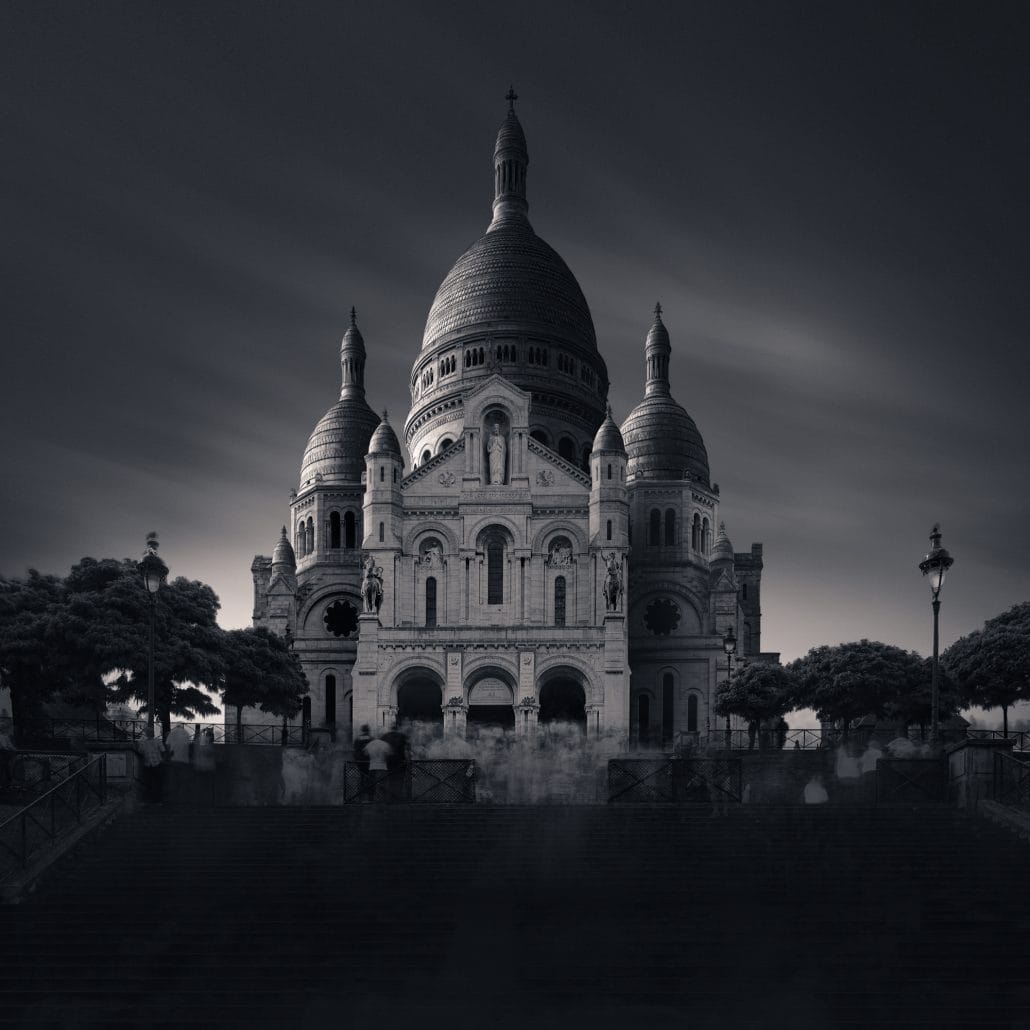
1 Long exposure: streaks of clouds that are too dominant 

This has actually become a list of my top pet peeves! No matter what you think of this list, I’m always trying to use arguments to support my case and my list. So let’s move on to the final commonly made mistake. Obviously, there are far more, and perhaps I will discuss another set of five the next time.

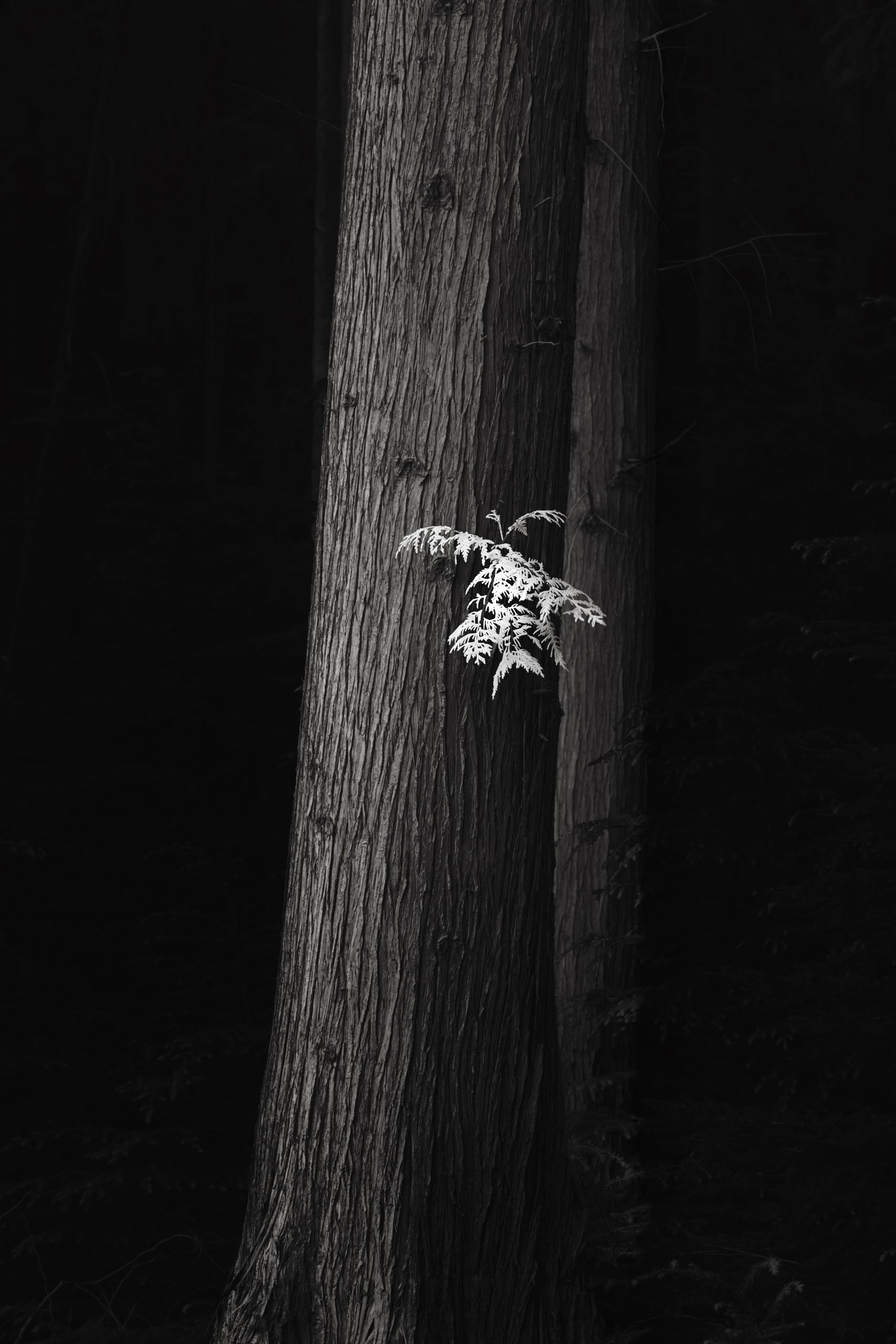
Long exposure photography, another popular genre. For me, long exposure photography was initially about the mystery it creates, the otherworldliness of it. Then it was about the special visual effects. These days, I’m still fond of the otherworldliness that a good long exposure photograph can convey. But equally important, these days I use it to diffuse the light, to remove traffic and people in my architectural photographs, and to soften clouds. To a lesser extent, I use it to create streaks of clouds. Actually, that’s exactly what I prefer to avoid now. I just like softer, almost invisible clouds. 

I know that the first thing people say when they see or want to try long exposure photography for the first time is: streaks of clouds! That striking visual effect from the use of ND filters evokes a feeling of wonder in everyone who sees it for the first time. But after a while, when you’ve done it all, tried it all, you should move away from that and use long exposure photography for what it can really do to your photographs. Because after all, if you shoot a building then that’s your most important object, your Figure, all the rest is Ground, including that sky with those streaks of clouds. Then why make that streak of cloud something that becomes more important than your building, that gets all the attention? If you want that, then don’t shoot that poor building. Or shoot the clouds as a Figure and the buildings you say you want to shoot, as the Ground and then demote that Ground. 

It’s good to have some interest in the sky with some soft clouds, perhaps soft streaks of clouds, but don’t make it too important if your goal is to shoot architecture or a tree or a mountain. The clouds just play a supporting role. And if you have streaks of clouds, then make sure in post-processing to lower the contrast there, make it less bright, as it’s still part of your Ground and only your main object should have the highest contrast and brightest light. See bullet 5, again. So perhaps, after all, there was a hierarchy in my top 5 list and number 5 should actually be number one as it always comes back to that important principle. And to close this off: that’s exactly one of the things I talk about and demonstrate in my 9-hr video on B&W fine art processing. So if you want to know more about this and other important elements in the artistic thought process and to see it being demonstrated in practice, then just have a look at the video.

Conclusion

The principle of creating selective contrast instead of using global contrast is perhaps the single most important principle in black and white photography and in color photography. Every entry in this top 5 is directly or indirectly related to this principle. Just any type of contrast is not enough, only selective contrast is the right type of contrast you should go for. But contrast is always relative!

Want to know more?

Share this post

8 Responses

  1. Your work takes my breath away. I am going to return to LE photos this winter and your work is the best inspiration for creating dimension in a 2D image. Thanks for sharing your immense body of knowledge!

  2. Exceptionally valuable advice, effectively communicated. I believe this post is the most useful “bite-sized” set of advice I’ve seen on good monochrome photography. I especially appreciated number 3 which I will remember as: “why use L0 when L23 does the job while leaving a hint of texture.” Thank you very much, Joel.

  3. Your comments and vision of black and white photography are very much appreciated and a good path to consider in our own work.

  4. Thank you too – it’s not easy to come with small bits of advice as they always tend to be more superficial. But I believe I found a good balance here: top 5s or 10s are the ideal format so I’ll be doing this more. Thanks again.

Leave a Reply

Your email address will not be published. Required fields are marked *

This site uses Akismet to reduce spam. Learn how your comment data is processed.

0
    0
    Your Cart
    Your cart is emptyReturn to Shop