

People ask me on a regular basis what my best black and white photography tips are, apart from the more generic tips like I shared them in this article. More specifically they sometimes ask me: what’s the difference between an award-winning or gallery worthy photograph and one that doesn’t make it to those categories? What’s the difference between a good and a bad black and white photograph?
Well sometimes the difference is an incompetent jury, an incompetent gallery owner, and other times it’s your photo or you, the photographer/artist, being the incompetent factor. And on very rare occasions it’s your wife, husband, kids, neighbours or your dog who are to be blamed for all the incompetency, at least that’s what you think.
What I’m trying to say: as long as there are different people, there are different preferences and tastes, and even different standards, because there’s not one final answer to what art is and what good taste or judgement is, in photography and art. Hence, I don’t know what the best black and white photography tips are. Which I think is my most honest answer.
But, one could think, that doesn’t explain why I have won many international awards over the years, just like most of my (previous) students, and why my work is in galleries. Here’s a possible explanation: I know what juries and collectors are looking for. And note that that’s not equal to knowing what is good, what is art and what will get the approval of an omnipresent connoisseur of all things art and sacred.
So I’ve collected some of the criteria that I always have in mind when assessing the technical and artistic qualities of a black and white fine art photograph. Criteria that I’ve developed over the years from own experience and only share, in a more elaborate way of course, with my students. Criteria that you can also find in several sections of the eBook From Basics to Fine-art, that I co-wrote with Julia Anna Gospodarou (and has a time limited Black Friday discount). But all of those collected criteria are evolving continuously. Here I share the latest evolution of my collected and most relevant criteria that, I think, can help you separate good from bad photographs, not only the good and bad black and white photographs from others but also from your own work, and can make your work better.
General and Artistic Criteria
1. There should be a difference between Object matter (thing in your frame) and Subject matter (your intention, or message you want to communicate). If you have a photograph for which can be said that subject matter is equal to object matter and there’s also another subject matter, then that photograph could most likely be an iconic photograph. Please refer to my Subjectivism Manifesto for more info on this topic and the essential difference between object matter and subject matter.
2. A fine art photograph should communicate and evoke an emotion or an experience. If your objective is not to evoke an emotion or an experience within the observer, then you’re just a skilled worker with a camera.
3. Avoid cliches. What is a cliche? If you experience or know something you haven’t experienced or known before, then it’s not a cliche. A cliche is something I’ve known or experienced before. If I see a photo that makes me experience or feel something I’ve experienced or felt before, then I may be amazed at the technical quality of it, but I will forget it the moment I move away from it.
4. I will look for authenticity in a photograph, meaning: it should have your own visual style. And your own message. Emulating other photographers is a good way to acquire new skills fast and effectively. But at some point you have to let go of it and find your own visual style. Even if that means your work will be less appreciated.
5. You should be able to know the message, not so much describe it.
6. The title of the photo, if any, or the theme in case it’s a series of photos, should reflect the message (or subject matter). Else just remove your title. Better nothing referring to something, than something referring to nothing.
Technical Criteria
1. Today everyone’s using selections, if you do that too then try utilising good selection techniques. There should be no halos, obviously and, much less obvious and something most people consistently ignore: no sharp edges for the outline of an object. Sharp edges in the outlines of buildings or other objects will look unnatural. Don’t sharpen everything, instead try to unsharp outlines of objects! You can do that with Da Vinci’s sfumato technique in mind who deliberately blurred, softened and decreased the contrast (because that is what causes sharpness — contrast) in the outlines of his objects.
2. Selective contrast is key: the eye should be drawn to the area with the highest light or luminosity contrast. Global contrast, same intensities of contrasts all over the image, disregarding the main object in your image, is not what good black and white photography is about, contrary to what many would say. And note that when you’re a color photographer, you not only have to deal with the luminosity contrasts but also with the contrast of colors.
3. Micro contrast should be avoided in other objects that are not the main object but also in the main object itself if it’s distracting. A harmonious photo of a beautiful rock for example, can have many details that make the photo look interesting, but those details should not be too high in contrast. Micro contrast is contrast other than the contrast between the main object and its surrounding — that is selective contrast — it is contrast on detail level that usually is distracting.
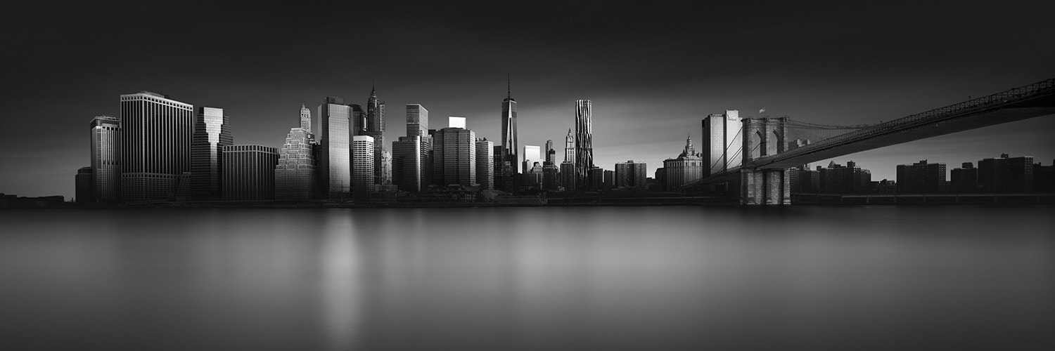
4. Strive for a ‘mid-gray zone’ in every photograph that’s dominant enough to counter balance the visual effects of abundantly using very dark and light tones at the same time. If your image is lacking enough mid-grays, then your image is lacking class. Simply put. I can put it in other, very different ways too btw.
5. No banding! Obviously. But how to get rid of it? There are several methods but adding a bit of noise will help. Or more subtle: add more tonal variation in the areas affected by banding. Usually those are larger areas, like blue skies, or smooth long exposure water areas, that don’t have enough tonal variation.
6. Gradients should look natural and unpredictable, and not linear. What I mean with that? Look at the blue sky above you (if you’re sitting outside reading this). Does it look like a sky with a perfect gradation from dark blue to light blue as if someone painted in the sky with a slide ruler? No it looks very different from linear. Look at a random black and white photograph. Zoom out till it’s close to thumbnail size. Do you see a linear black band in the top edge, usually skies, or the bottom edge, usually water areas? That’s a bad black and white photograph. Use luminosity masks in a creative way to create unpredictable gradations, or use your fantasy. I can demonstrate more ways and techniques, but then you’ll have to sign up for a private mentorship or workshop. I can’t tell you everything here.
7. The darkest blacks should only be present in your photograph in areas where there is no detail and only if it’s almost invisible (just a small percentage of the total photo).
8. The visible and dominant darkest tones should always be in zone 1(less) and zone 2 (more).
9. The same applies to high lights. The brightest whites should only be present in your photograph in areas where there is no detail and only if it’s almost invisible (just a small percentage of the total photo)
10. The visible and dominant lightest tones should always be in zone 8 (more) and zone 9 (less).
Compositional Criteria
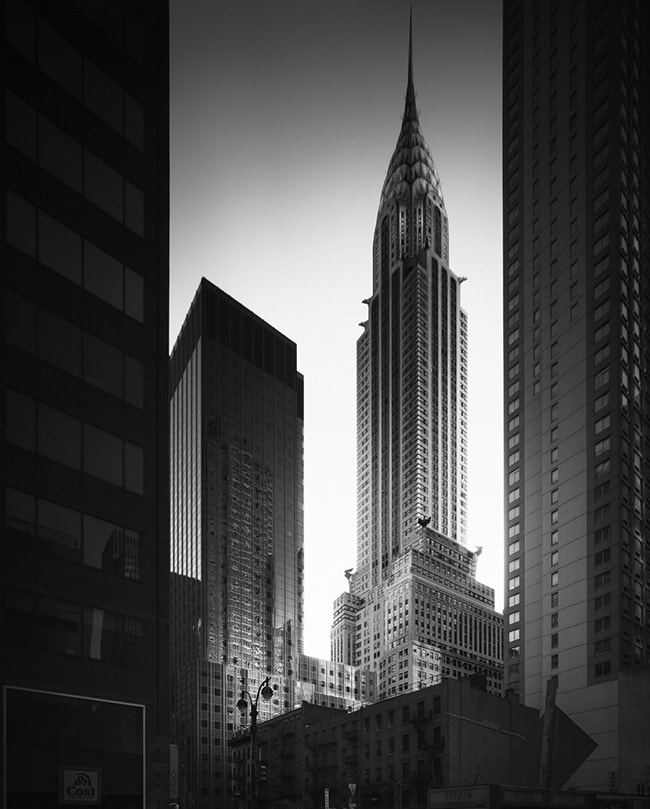
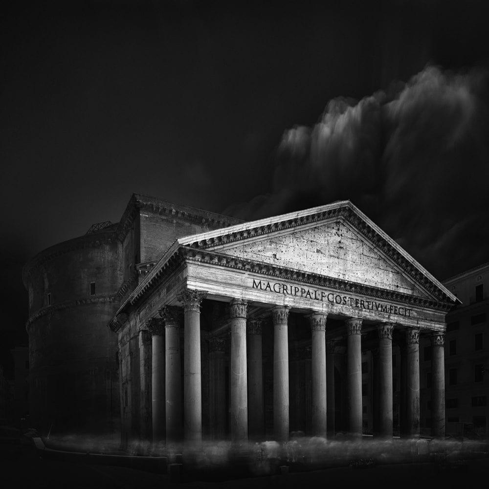
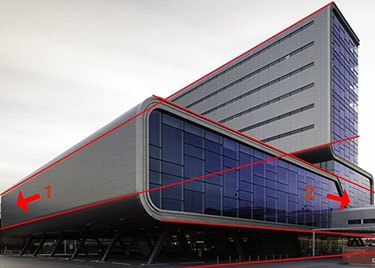
1. In architecture: strive for multiple point perspectives. Rules of linear perspective are more important than rules of thirds or golden ratio in architecture because they target the main object directly. Always keep in mind that compositional rules like the Rule of Thirds or the Golden Ratio, say more about the use of spaces surrounding or in-between objects and their proportions, and less or nothing at all about the object itself! They don’t relate specifically to the object matter at hand. Such conventional rules should be considered secondary rules in architecture. Rules of linear perspective are the primary rules for composition in architecture.
2. In architecture: bring life in your objects not only by way of post-processing but also by getting up-close to your architectural object. Find the angle that adds the 3rd dimension (the strong diagonal). This is related to finding a multiple point perspective, such as a 2-point perspective.
3. In landscapes: aim for atmospheric perspective by way of post-processing and by using the right aperture, focus and exposure time in your shot. Do you really want a large depth of field? I don’t. Rules of atmospheric perspective are in my view more important than rules of thirds or Golden Ratio in landscapes. They’re secondary rules again.
4. If an architectural photograph has multiple objects then the supporting objects that are farther away from the viewer should preferably also have atmospheric perspective.

A few more things
You may have an opinion on what I wrote in this article. Perhaps you will trash this article because you oppose my views. Maybe you’ll ignore it, because you don’t accept what others say. It’s all good. But don’t be critical without coming up with alternatives. It’s easy to reject things you don’t like, don’t believe in, or that you couldn’t think of yourself, without offering an alternative. I’m here to give my opinion, quite often by tearing down other rules, but I always try to give an alternative.
So far, this has worked for me, and for many of my students and readers. I’m trying to hold on to that thought, it might mean I’m onto something. The alternative is me expressing my frustration towards my neighbors. I dislike them anyway.


3 Responses